Want to upgrade your style without spending big money then you must understand how colors work together. Forget basic navy and white because true style is about how fabrics absorb light. Here are the color combinations that instantly make outfits look way more expensive.
Antique Ecru and Solaro

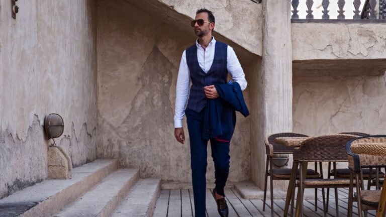
Solaro is this cool heritage fabric that literally shifts colors depending on how sunlight hits you. Pairing it with antique ecru gives you this really warm optical harmony. It makes you look like a walking oil painting instead of a boring color block.
Rita Green and Bitter Chocolate
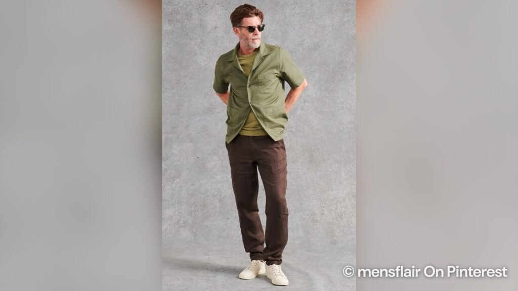
Most guys go for olive and tan but that looks a bit too outdoorsy like you are going camping. Mixing a dusty grayish Rita green with a dark bitter chocolate brown is much better. This combo gives off a rich autumn landscape vibe that looks incredibly sophisticated.
British Khaki and Chambray Blue
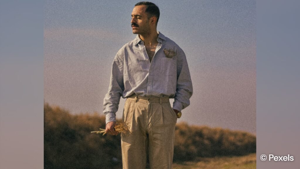
The standard white shirt and beige chino combo creates a harsh divide that looks like a basic office uniform. Blend a muddy British khaki with a dusty pale chambray blue to fix that. These colors share a weathered quality making you look like you are on a Mediterranean trip.
French Navy and Faded Terracotta
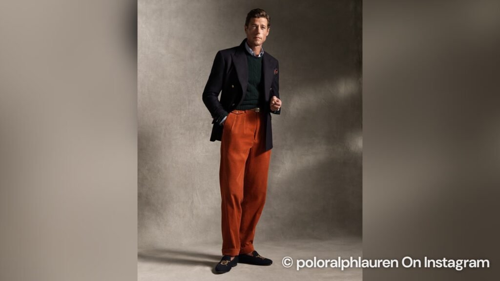
Bright orange and navy totally belong on a football field but faded versions look super elegant on clothes. A matte French navy acts as a cool anchor while faded terracotta brings a nice quiet warmth. This creates a visual tension that looks grounded and very stylish.
Stone Gray and Oatmeal
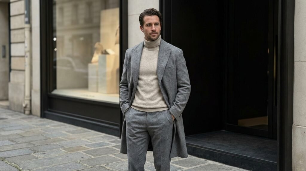
Breaking the rule of only mixing warm colors with warm colors is the real secret to looking expensive. Stone gray is cool like wet limestone and oatmeal is a warm natural wool color. Putting them together creates a subtle tension that tricks the eye into seeing amazing depth.
Air Force Blue and Camel
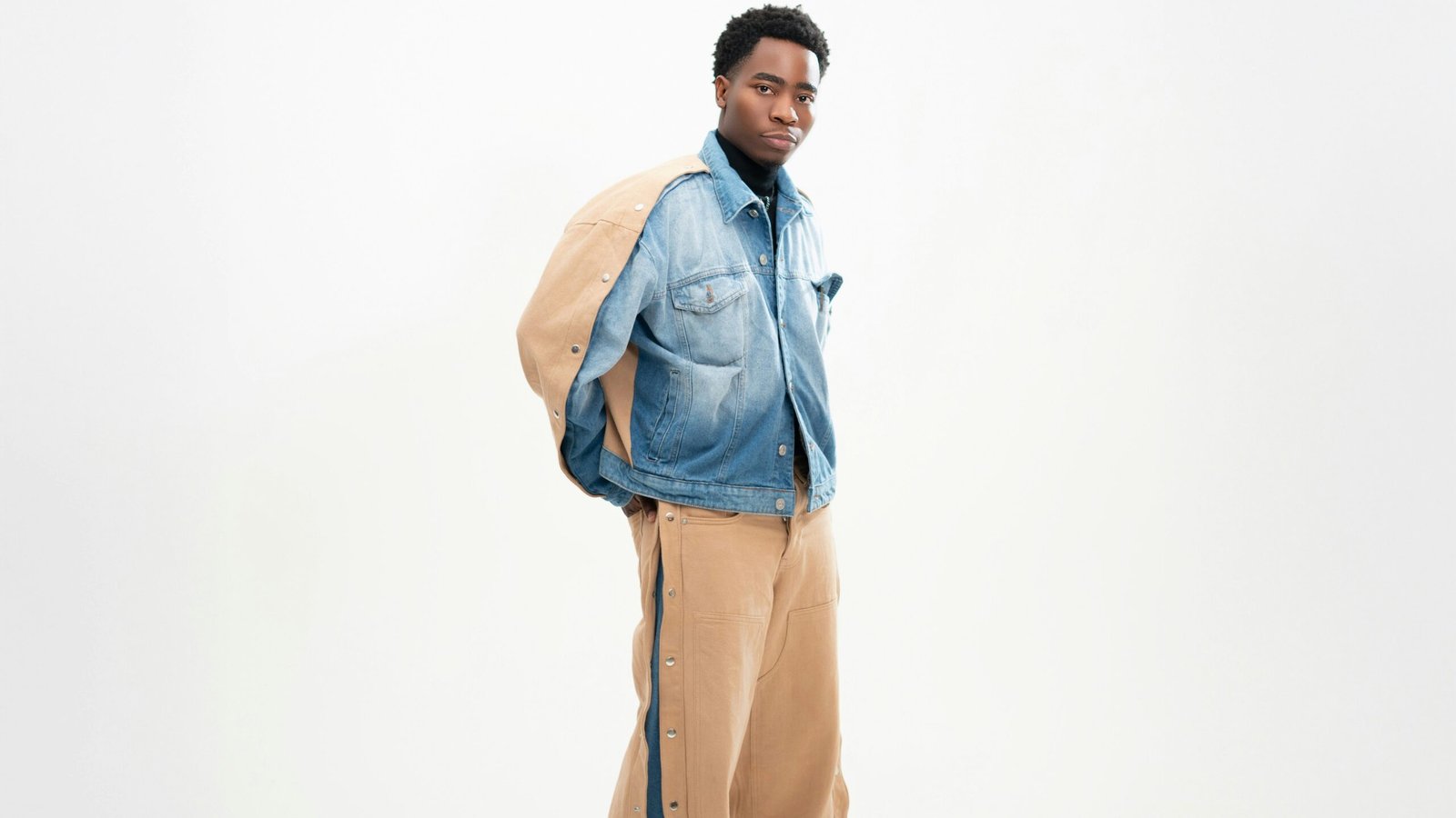
Air force blue sits between navy and gray so it has authority without being too stiff. Camel is a rich golden tan that activates the hidden blue tones when they are worn together. This is perfect for winter because camel looks amazing in low sunlight.
Alabaster White and Sage Green

Pure white can sometimes look too clinical just like a brightly lit hospital hallway and nobody wants that. Alabaster white has a chalky mineral undertone that pairs perfectly with a silvery desaturated sage green. This creates an effortless look that shows you really understand how to dress well.
Midnight Navy and Charcoal Gray

People say never to mix dark navy and charcoal gray but it actually looks amazing in the evening. This shadow depth creates an aristocratic frame that looks incredibly expensive when the lights are low. Just skip the white shirt so you keep that seamless dark gradient going strong.
The Power of Low Saturation
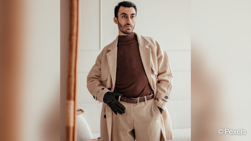
The trick behind these combinations is choosing colors with low saturation instead of loud neon shades. Muted tones make your clothing behave with the environment rather than just sitting flat and looking cheap. You do not need a massive budget when you understand how muted tones interact.
Texture and Natural Fibers

Color is only half the battle since your fabric changes how those expensive shades are absorbed. Natural materials like linen and suede soak up light to give your clothes a richer appearance. Combine great textures with smart colors and you instantly upgrade your entire wardrobe.
About the Author